Choosing the colour for a workspace or even a relaxation area is no easy task. It does not depend solely on current trends or the decision-maker’s taste.
Choosing colours for a space is a complex task that requires knowledge and research. It is a choice that must be carefully considered, as it will have an impact on the occupants of the room in question. However, this decision only comes later (this will be the topic of our second article, to be published next month).
Studying the location and its users is essential and should be the first thing to consider. Find out what you need to pay attention to.
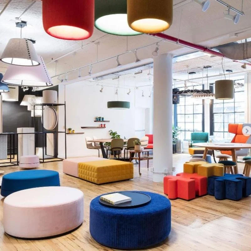
Knowing the user of the premises:
Given that our reaction to colour is linked to our perception, which is entirely subjective, it is crucial to know who will be using the space. Are they employees, students, patients, visitors, permanent residents or temporary occupants, elderly or young? What do they want to change or create?
Targeting expectations:
When choosing a colour, it is not just a matter of choosing between blue or green, yellow or red. Each colour comes in dark or light shades and in a more or less chromatic range, generating different feelings when viewed.
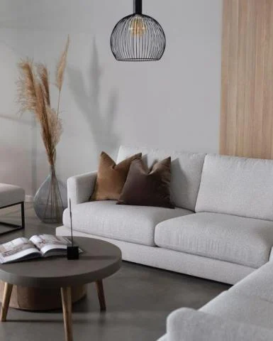
If you want to create a sense of tranquillity, play with a colour that you will shade, giving it different intensities and chromaticities. This is called working in “monotone”.
Looking for ‘comfort’? Subtle, warm colours help to create cosy environments.
Lighter shades make spaces appear larger and more airy.
Rhythmic, graphic colour arrangements add dynamism.
Want to create a safe, reassuring place in a room with high ceilings? Paint the ceiling a dark colour to make it seem closer to you and make you feel less lost.
Involving the user:
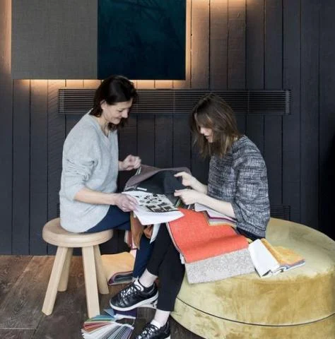
In addition to getting to know the occupants, it is important to involve them in the colour study. Colours have an impact on morale, motivation and behaviour. They are therefore the first to be affected by the choices made.
Observe the premises:
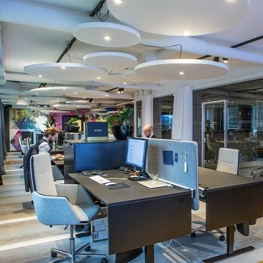
Finally, it is also important to consider the location itself. Artificial and natural lighting, orientation, acoustic constraints, floor coverings, materials and spatial layout all influence the surfaces where colour will be applied.
Similarly, the external environment will influence internal expectations. Living in the city centre will create a much greater need for ‘green’ indoors than living in the countryside. The shade of green and its quantity will be influenced by this.